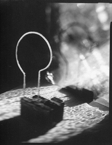
Black-letter is a speculative examination by artist and conceptual bookmaker Jeffrey Atherton. Patterned after his highly regarded parallel history Notes for A Lost Play, Atherton’s distinctive writing style brings a pre-Modernist flavoring and sensibility to this new work. Written in a fragmented polyphonic narrative (the text is a synchronized gathering of historical and technical notes, and fictional journal entries, scene descriptions, letters, dialogues, dreams, and songs), the book is fashioned as a bibliographic ghost representing a compilation of the flotsam surrounding the “Gutenberg Controversy” that raged in the late 19th century and into the early years of the 20th. The book is based on the extant Gutenberg research and historical studies of the time period, and was drawn from an idea by Gerald Lange, who was responsible for the book’s contextual arrangement, editing, and typographic design. Black-letter features a collotype printing of Atherton’s imagistic studio photograph, “mirror and mould.”
Reviews:
Of all the published celebrations that marked Gutenberg and the year 2000, this . . . is one of the more original. . . . This is an ingenious book, and it is a considerable technical achievement in its own right. . . . Altogether, this is a book that repays careful study. — David McKitterick, The Book Collector
. . . all the validity of a new translation of a classic . . . the design and development of what Gutenberg wrought is illuminated as never before . . . one of the most amazing bibliographic conceits of my experience. — Decherd Turner, Parenthesis
. . . a book to be savored cover to cover, or to be opened at random and enjoyed bit by bit . . . a worthy California entry to the world-wide celebration of the 600th anniversary of Johann Gutenberg’s birth. — Adela S. Roatcap, California Book Club Quarterly
Black-letter was digitally set in Carter & Cone Type’s Miller Text (a Matthew Carter typeface design based on 19th-century Scotch romans) and Cézanne (display) from P22 type foundry. Both fonts were configured for letterpress printing with editing software. The digital imaging was printed in two colors from photopolymer plates and the photograph printed from glass plates. Atherton and Lange collaborated on both printings. The text sheet is handmade Fabriano Umbria Bianco. The books were bound by Daniel E. Kelm at the Wide Awake Garage in a cantilevered board construction covered in Japanese silk fabric with flatback quarter spine. The binding features a die-cut window that reveals the collotype print.
Limited to 120 numbered and 26 lettered copies signed by the collaborators. 9.5 by 12.75 inches. 45 pages. ISBN 0-931460-29-8 (numbered), ISBN 0-931460-34-4 (lettered, housed in a clamshell-style box along with an inked glass plate used to print the collotype). Numbered copies, $1,500. Lettered copies $2,975. A PDF of the prospectus is available upon request.