Limited edition titles


Please direct all inquiries to The Bieler PressThe Bieler Press Catalogue is available in PDF form. This provides information on most currently available Bieler Press books, chapbooks, and broadsides (including currently in-print titles produced for other publishers and available direct from the Press).

Items can be purchased via check or PayPal (PayPal payment address is our email address). There are no shipping charges on prepaid orders (US only) on Bieler Press limited edition book titles. Institutional collections are eligible for a 10 percent discount (does not apply to listed titles released by other publishers). The trade should contact us for terms.

Special: See http://bielerpressv.blogspot.com/2010/03/claudius-fraktur-type-specimen.html

Aldine Press (special offer)

The Aldine Press

The Aldine Press: Catalogue of the Ahmanson-Murphy Collection of books by or relating to the Press in the Library of the University of California, Los Angeles; incorporating works recorded elsewhere.

This massive tome is the culmination of a four-year project; containing some 1,370 quasi-facsimile bibliographic descriptions of the printed work (1495–1589) of Aldus Manutius, his heirs, and related material. It includes a lengthy introductory essay (by editor Nicolas Barker), illustrative matter (378 typefaces, printer’s devices, and reconstructed watermarks), and referential information (tables, concordance, and indexes).

The typographic demands of a catalogue on this scale were large, and we were fortunate in finding two artists equal to them. Matthew Carter, Carter & Cone Type, Cambridge, Massachusetts, designer of Wilson (Greek) and Miller (roman), the first entirely successful match of Greek and roman type in digital form, adapted them to the needs of the project (renaming them Manutius). The reconfigured founts required many special characters, whose varying shapes and number tested his skill and patience to the utmost. To the success of his work the ensuing pages are the best tribute. Their elegance, a notable achievement in a work of severely technical character, is due to Gerald Lange, of The Bieler Press, Marina del Rey, California, who had chief responsibility for the book’s typographic design. This again was a task that went far beyond the normal task of laying out printed matter. His enquiring mind looked beyond its original form to the reasons for thus presenting it; this Socratic approach immeasurably improved the logic of its arrangement. His sure but unassertive sense of design has given it further grace. To both we are especially grateful. —Nicolas Barker

The typographic considerations involved in the production of this book were detailed in an article by Gerald Lange in Printing History: the Journal of the American Printing History Association, 2001.

Published by the University of California Press in 2001. One of the earliest uses of Adobe’s new PDF software for the production of negatives (I spent several weeks testing it out for them!). Printed on Mohawk Superfine, an acid-free paper, in an edition consisting of 425 copies. The book measures 9 by 12 inches (with cloth covered slipcase) and weighs over eight pounds. 673 pages. ISBN 0-520-22993-2. LC 00-064851.

Out-of-print from publisher, $500 (plus shipping). We have a limited number of these available in original shipping boxes for dealers (3 books per shipping box, $1,095).

Last Bieler Press Commissioned Work

The last work produced by The Bieler Press (2014) was An Elegie by Ben Jonson. The type was set in the Civilité, Saint Augustin, by Mark Askam at Chestnut Press. The chapbook was designed and printed by Gerald Lange. Hand sewn and published by Anthony Baker at The Gruffyground Press as the second (Bieler Press) publication in his Shakespeare and His Contemporaries series.

The Blizzard Voices / Ted Kooser / Tom Pohrt

BVcover2

Ted Kooser has recently served two consecutive terms as U.S. Poet Laureate and was winner of the 2005 Pulitzer Prize in Poetry.

The Blizzard Voices was produced in 1986 and is a collection of Kooser’s poems that provide a haunting dramatized narrative of the devastation unleashed on Nebraska Territory by the Great Blizzard of January 12, 1888 (which is often referred to as “The Children's Blizzard”). His text was drawn from the reminiscences of the survivors: the men and women who were teaching school, working the land, tending the house – when the storm arrived and changed their lives forever. Tom Pohrt illustrated the book with twelve period-like line drawings.

Kooser experimented with a completely new style in The Blizzard Voices. . . a poetic conversation, according to the author, “based on the reminiscences of those men and women who witnessed the great blizzard of January 12, 1888.” Originally written for the theater, the book comprised a series of surrealistic monologues recounting individual perceptions of the blizzard, alternately titled “A Man’s Voice” and “A Woman’s Voice.” With their unique style, these narrative poems demonstrated an expanded linguistic scope, proving that Kooser was capable of writing more than just his trademark poem. —Copper Canyon Press

Fine presses often publish poetry, but this to my mind is one of the most elegant, striking examples of poems on the page, greatly enhanced by Tom Pohrt's illustrations. —Richard Goodman, Fine Books & Collections: 2009 Compendium

The Blizzard Voices is available from The Bieler Press in a letterpress printed limited edition produced in 200 numbered copies signed by Kooser and Pohrt.

BVtitle

Designed by Gerald Lange and printed with assistance from Philip Gallo. The book was handset in Monotype Garamont and 16th Century Roman (display - cast by Paul Hayden Duensing) and printed on moldmade Frankfurt White paper. Kathryn Clark at Twinrocker Handmade Paper created the handmade paper covers and endsheets for the edition (the cover sheet is a blizzard-white on stormy-blue pulp design). The book was bound in boards at The Campbell-Logan Bindery. 55 pages in 5-3/4 by 9-1/2 inch format. $425.

The University of Nebraska Press acquired the reprint rights for the out-of-print trade edition of this title (originally reproduced from the limited edition) and released a paperback edition under its Bison Books imprint.

In addition, Opera Omaha produced an oratorio drawn from the work and Omaha Children's Museum featured selections from the book in an exhibition relating to the Great Blizzard.

Black-letter: an interpretation of events relating to the time and presence of Johann Gutenberg / Jeffrey Atherton

mould_mirror
Black-letter is a speculative examination by artist and conceptual bookmaker Jeffrey Atherton. Patterned after his highly regarded parallel history Notes for A Lost Play, Atherton’s distinctive writing style brings a pre-Modernist flavoring and sensibility to this new work. Written in a fragmented polyphonic narrative (the text is a synchronized gathering of historical and technical notes, and fictional journal entries, scene descriptions, letters, dialogues, dreams, and songs), the book is fashioned as a bibliographic ghost representing a compilation of the flotsam surrounding the “Gutenberg Controversy” that raged in the late 19th century and into the early years of the 20th. The book is based on the extant Gutenberg research and historical studies of the time period, and was drawn from an idea by Gerald Lange, who was responsible for the book’s contextual arrangement, editing, and typographic design. 
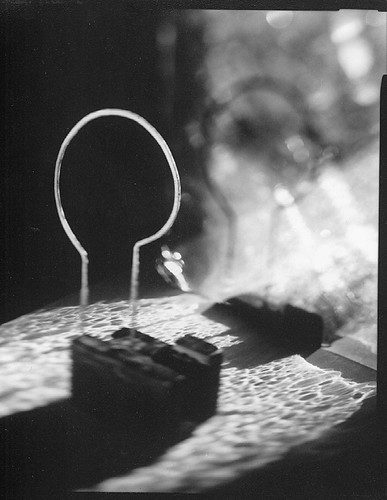
Black-letter features a collotype printing of Atherton’s imagistic studio photograph, “mirror and mould.”

Reviews:
Of all the published celebrations that marked Gutenberg and the year 2000, this . . . is one of the more original. . . . This is an ingenious book, and it is a considerable technical achievement in its own right. . . . Altogether, this is a book that repays careful study. — David McKitterick, The Book Collector
. . . all the validity of a new translation of a classic . . . the design and development of what Gutenberg wrought is illuminated as never before . . . one of the most amazing bibliographic conceits of my experience. — Decherd Turner, Parenthesis
. . . a book to be savored cover to cover, or to be opened at random and enjoyed bit by bit . . . a worthy California entry to the world-wide celebration of the 600th anniversary of Johann Gutenberg’s birth. — Adela S. Roatcap, California Book Club Quarterly

Black-letter was digitally set in Carter & Cone Type’s Miller Text (a Matthew Carter typeface design based on 19th-century Scotch romans) and Cézanne (display) from P22 type foundry. Both fonts were configured for letterpress printing with editing software. The digital imaging was printed in two colors from photopolymer plates and the photograph printed from glass plates. Atherton and Lange collaborated on both printings. The text sheet is handmade Fabriano Umbria Bianco. The books were bound by Daniel E. Kelm at the Wide Awake Garage in a cantilevered board construction covered in Japanese silk fabric with flatback quarter spine. The binding features a die-cut window that reveals the collotype print.

Limited to 120 numbered and 26 lettered copies signed by the collaborators. 9.5 by 12.75 inches. 45 pages. ISBN 0-931460-29-8 (numbered), ISBN 0-931460-34-4 (lettered, housed in a clamshell-style box along with an inked glass plate used to print the collotype). Numbered copies, $1,500. Lettered copies $2,975. A PDF of the prospectus is available upon request.

The Neolithic Adventures of Taffi-mai Metallu-mai / Rudyard Kipling

Kipling2
The Neolithic Adventures of Taffi-mai Metallu-mai: How the First Letter Was Written and How the Alphabet Was Made, Just So Stories by Rudyard Kipling.

The primal tales of the Just So Stories, created in response to the innocent queries of Kipling's oldest daughter, existed in oral form long before publication. Kipling refined them through continual retellings and introduced drawings also meant to answer questions in an elemental manner. The two tales that comprise this edition, “How the First Letter Was Written,” and “How the Alphabet was Made,” were chosen because of their shared heroine (the author's Neolithic inventor of writing), and their affinity with subjects related to the lettering arts. Kipling’s petroglyph-like drawings reinforce the primal nature of the tales.

Perhaps the most elaborate of all the Kipling fine and private press editions.—Parenthesis

Produced by Gerald Lange, the work has some intriguing features:
The text sheets were individually water colored in the ancient urazaiskiki manner and printed damp. Kipling’s drawings (cumbersomely executed in previous editions) were printed on separate sheets and inserted between the folded leaves of the edge-sewn binding, revealing themselves in the background of the story.

Letterpress printed from handset Monotype Pastonchi and a digitally altered version of Berthold Post Antiqua, the book was hand bound with hinged covers, tortoise shell pattern stitching and hardwood spine. A number of exotic Asian handmade papers were used in the production: Kitakata for text, Gampi for inserts, Kasuiri and Chirizome for end sheets, Cogan Grass for covers. A multi-colored photo-print of Kipling entrancing a group of children with his storytelling, provides entry into the book.

The careful attention to detail and integration of elements enhance the presentation of the stories and make this an exceptional edition. A grassy scent rising from the pages adds to the magic.—Califia Books

10-1/4 by 8-1/2 inches. 55 pages with 17 additional illustrated page inserts. Edition limited to 150 numbered copies. [Only 79 copies were completed in binding state—which is out-of-stock]. Marina del Rey, 1997. Unbound sheets, $675.

The Letter of Columbus on his Discovery of the New World

ColoCover
This book showcases a facsimile of the famous Stephen Plannck 1493 Latin edition of the Columbus Letter (De Insulis inuentis. Epistola Cristoferi Colom.) and includes an introduction describing the voyage and the events surrounding it, an English translation by Columbus historian Samuel Eliot Morison, and a bibliographic afterword providing information on the near 500 year publishing history of the Letter. Five woodcuts from the Basel Latin edition of 1493 illustrate the text. Also included is a title-page illustration of a sketch-map (attributed to Columbus) of the West Indies, considered the first cartographic view of the New World.

The Letter of Columbus has all the characteristics of a mature and talented craftsman who knows what he is about. . . clean, handsome, straightforward, and unpretentious, an appropriate vehicle for prose uncluttered with hyperbolic purple.—Fine Print
ColoTitle
Recipient of the first annual Carl Hertzog Award for Excellence in Book Design.
Documentation detailing the production of this book appeared in the Italian journal Columbus 92 in 1990.


The Letter of Columbus was designed by Gerald Lange and letterpress printed by Robin Price. It was handset in Monotype Poliphilus and Forum Titling (display) and printed in two colors on Frankfurt Cream mouldmade paper. The book measures 6-1/2 by 9-3/4 inches. 51 pages.
The edition consists of 300 numbered copies bound in Zanders’ Elephant Hide paper (with Nigerian goatskin spines). This was the first book publication of the USC Fine Arts Press, 1989. Available direct from The Bieler Press. $475.

Wild Parrots and the King of La Brea / Gerald Lange / Robert Dansby

King1
Wild Parrots and the King of La Brea. A journal-like account of deleterious obsession, the book was fashioned after a mid-century Art brut artifact. It opens with a description of an ogbanje, “a demon of unknown origin who inhabits the bodies of humans one after the other, completely displacing the mind and soul of its victim . . . .”

Wild Parrots and the King of La Brea is very legitimate, erotic and haunting. . . a very fine rendering of the dislocation and pointlessness that follows [obsession]. —Lindsay Hill
King6
The book was conceived, designed, and printed by Gerald Lange and illustrated by artist Robert Dansby (Jiggs). The three dozen sketch drawings reflect the thoughts and memories of the narrator, reinforcing the intimacy of the story telling. Each text page was further exhaustively hand illuminated by Dansby with alcohol-based staining developed specifically for the project at the Press. The text was digitally set in a modified version of Panache Typography’s Lettrés Eclateés with full sequential use of the complete set of lowercase Alternates. The book was letterpress printed on dampened Usuzumi, a pale green Japanese paper, and bound Ethiopian coptic-stitch style, corded to hand variegated covers of ink-stained Honduras Mahogany quarter-inch plank.

7-1/2 by 10 inches. 57 pages. Marina del Rey, 1998. The edition was limited to 135 numbered copies signed by “Jiggs” and “the King.” [Only 65 copies were completed in binding state]. $600 (unbound sheets available).

The Compleat Melancholick / Lewis Turco

CMcover
The Compleat Melancholick: Being a Sequence of ‘Found, Composite, and Composed’ Poems, based largely upon Robert Burton’s The Anatomy of Melancholy, by Lewis Turco.

Designed and printed by Gerald Lange. Handset in Monotype Plantin and letterpress printed on Mohawk Letterpress Text paper. The gray-blue paste paper covers were produced by Gregor Campbell and quarter bound in boards at The Campbell-Logan Bindery. Issued in an edition of 150 numbered copies signed by the author.

Illustrated with a hand-colored woodcut, Melancholy, from the Augsburg Calendar (ca 1480).
CMIllusclose
A witty sequence of poems that have less to do with melancholy than with the joy that comes from using an evocative and poetic diction not ordinarily available to the 20th-century poet. Turco makes use of Burton’s language, placing phrases and whole passages in new contexts that are a delightful reflection on Burton and good new poems in themselves.—Choice

5 by 8 inches. 69 pages. 1985. $150.
CMpaper
This title is also available in a paperbound trade edition that was lithographically reproduced from letterpress proofs of the original limited fine press edition. $13.95.

Moon / David Romtvedt

MnCover
Moon was David Romtvedt’s first book-length collection of poetry, and was illustrated with three scratch board drawings by R. W. Scholes. Romtvedt is current Poet Laureate of Wyoming.

This book neither swaggers nor complains; it rests in the hand; it breathes. It is what ought to be merely ordinary in literary publishing – just as peace should be normal on earth and good will, as they say, among women and men. . . the publisher seems to know and believe in what he is doing. He seems to have reasons deeper than self-indulgence, more interesting than survival, and more vigorous than despair. Of how many presses can this be said?
—Robert Bringhurst, review in Fine Print
MnIllusMnTitleClose
Moon was designed and letterpress printed by Gerald Lange. It was handset in Monotype Bembo and Centaur and printed on moldmade Nideggen paper. Quarter bound in tan cloth at Campbell-Logan Bindery.

Recipient of an American Institute of Graphic Arts Book Show Certificate of Excellence, a Type Directors Club Exhibition Citation for Typographic Excellence, and a Chicago Book Clinic Exhibit Certificate of Award.

Issued by The Bieler Press in an edition of 150 numbered copies signed by the author and the illustrator. 1984. 79 pages. 6-1/2 by 10 inches. $225. Note: The paperback trade edition of this title is out-of-print.

Reincarnation Fables / John Gilgun / Michael McCurdy

gilgun

Everything That Has Been Shall Be Again, the first published collection of the reincarnation fables of John Gilgun. Each of these nine stories is illustrated with an original wood engraving by Michael McCurdy.

An ingenious new fabulary in a philosophical vein. . . the American sound of some of the monologues makes a noteworthy contribution to the genre of the fable and stakes out some ground for the New World in this decidedly Old-World field. —Fine Print

This is the paperbound trade edition that was lithographically reproduced from letterpress proofs of the original limited fine press edition [out-of-print]. Printed on acid-free paper and machine sewn in signatures. 5-1/4 by 7-3/4 inches. 69 pages. The Bieler Press, Saint Paul, 1981. $12.95.